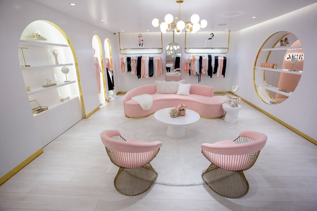
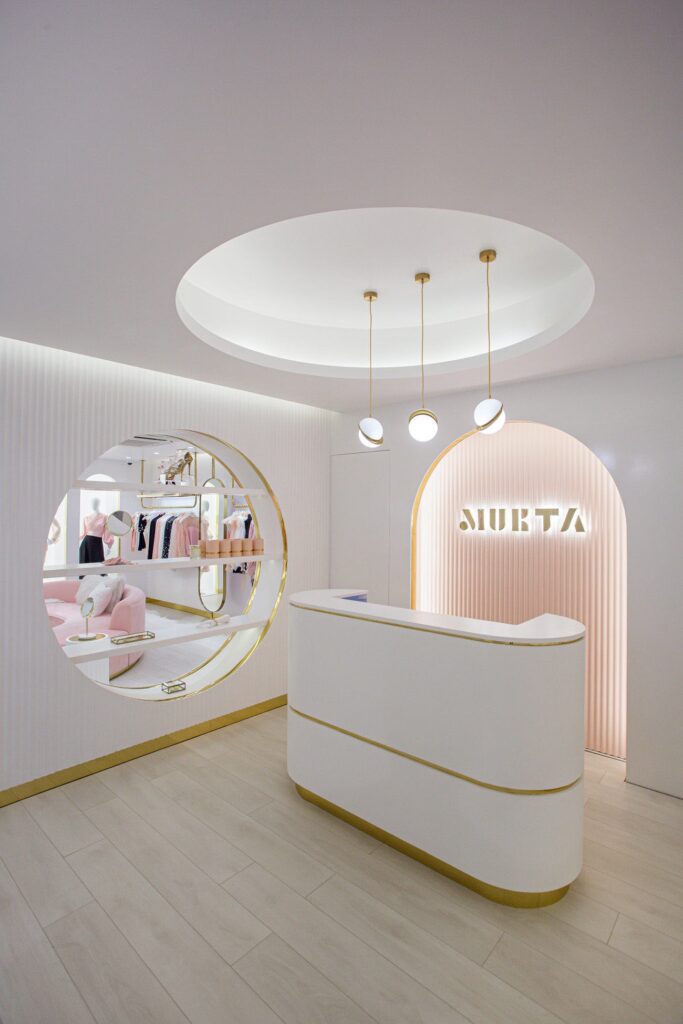
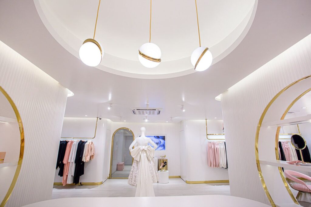
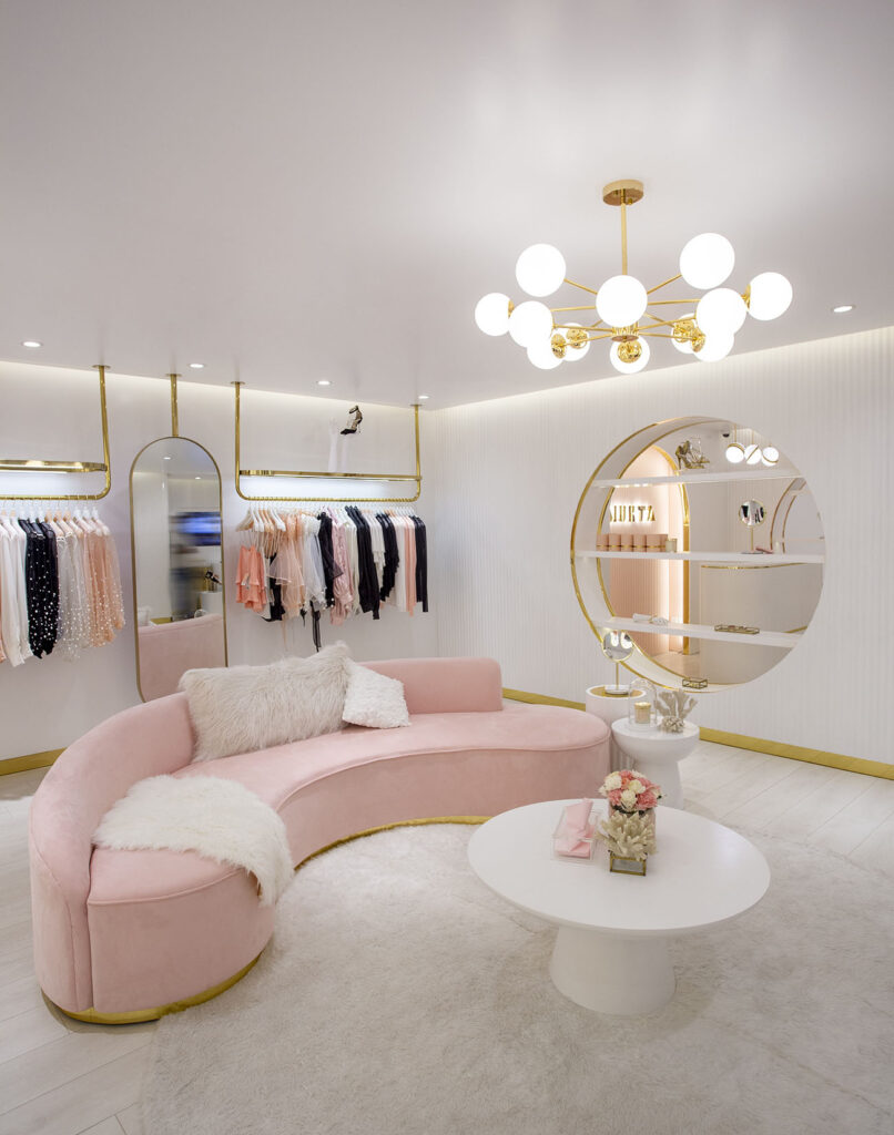
The newly launched luxury label MUKTA was conceptualised in 2016, over a cup of coffee when architect and designer Faria Mehmood was discussing with her mother about her love for art and storytelling and the need of establishing an instrument to explore this passion. However, it wasn’t until 2017, that she officially started the journey with a small studio, with the desire to create collections based on beautiful concepts and translate the aesthetics and emotions into tangible objects – objects that act like puzzle pieces that eventually merge to reveal a complete story. Set on the thriving road 11 in Banani, the retail outlet embodies an opulent and timeless setting with its soft pink and white hues, golden framework and luxe accents.
Tell us the story behind the name of your label?
MUKTA is named after my mother – my eternal muse. She introduced me to the world of elegance created by all the great French Maison that have inspired me and eventually shaped my sense of style. And it was through this mother-daughter bond that the brand found its name.
The outlet is undoubtedly detail-oriented. When did you start designing and how long did it take to complete?
The design aesthetics directly flowed from the brand’s identity, which was established during the brand’s conceptualisation. The interior elements of the store were developed in the beginning of 2019 when I was designing in a different proposed location, but after a shift in the current space – we began to do detail design in September 2019, and began full construction by October. It had detail bespoke work throughout that was developed both locally as well as internationally, and took around 3-4 months’ time to fully complete.
However, due to different complications faced by the brand including the pandemic, the outlet wasn’t launched until recently.
Tell us in brief about the products you are offering- the design philosophy, colours, fabric and materials. What is the inspiration behind it?
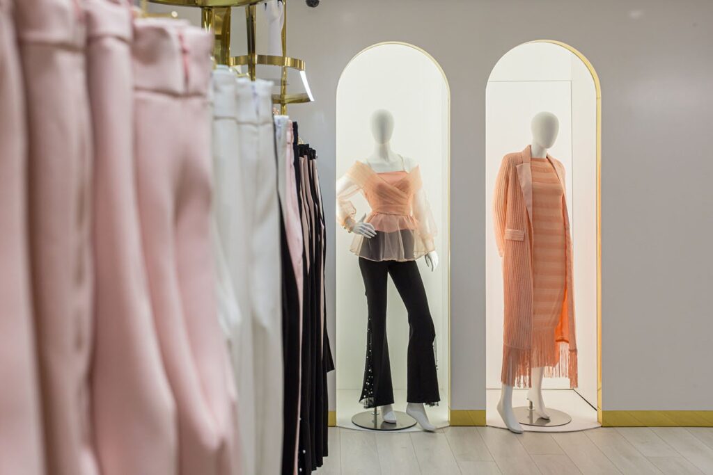
Pearls have always symbolised elegance and femininity, and when we look at style of today, that is something we miss. Therefore, when we were designing our debut collection “Namesake”, we explored deep into the beauty of this gem and took refuge in the era that adulated pearls the most. The 50s have been an era that celebrated pearls and shaped our imagination of style. Painted with the most appreciated hues of the pearl – white, pink and black; the timeless pieces are inspired by the textures, pleats and forms of not only the gem, but also reminiscent of their birthplace – the shells and oysters. We have also studied the patterns and forms of the 50s extensively to create similar aesthetic and silhouettes inspired by the time.
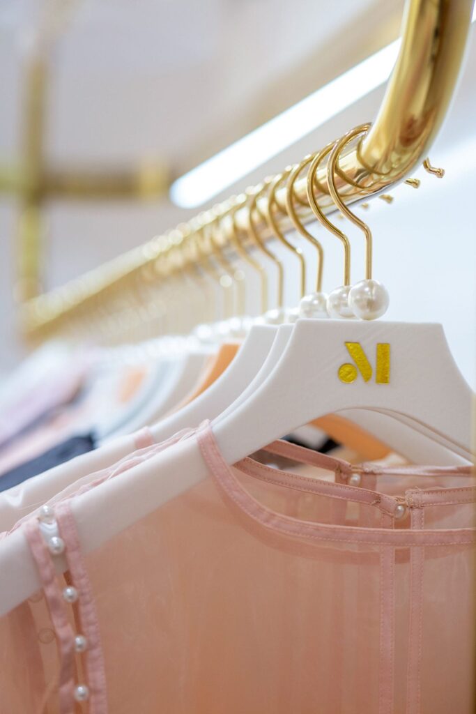
The collection has been divided into three distinct category – Ready-To-Wear, Maison (homeware) and Beauty. We are offering a wide range of products beginning from jewellery, belts, sunglasses, scarves, dresses, blazers, trousers, skirts and blouses within the Ready-To-Wear section, whereas the Maison has our own line of lush scented candles, exquisite furnishing and lighting. Our Beauty line is still under development and focuses on ‘Beauty from Within’ and hopefully will be revealed at the end of 2021.
Ultimately the vision remains to tell stories of strong women and paint their personalities, in MUKTA’s individualistic recognisable aesthetic language.
How is the interior of the outlet influenced by the theme of Mukta?
Creating anything starts with storytelling for me. For me, the interior needed to tell the story of the brand – of the gem and the femininity that it represents. Once that idea was established, every aspect of the design flowed organically from it. I wanted to have a specific language that will become synonymous to the brand’s outlets.
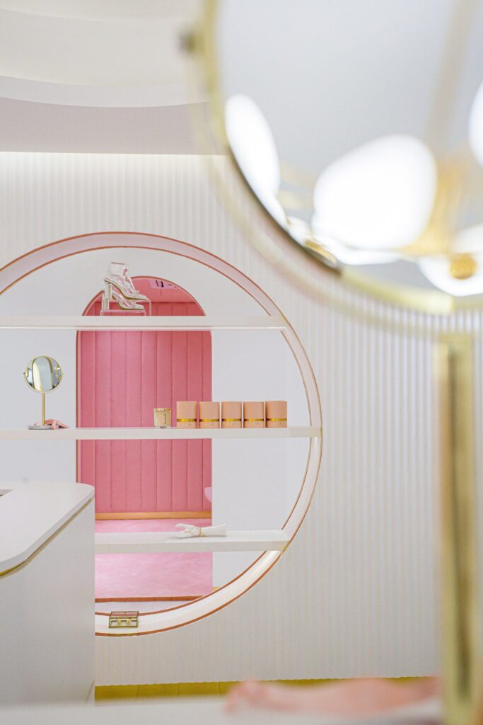
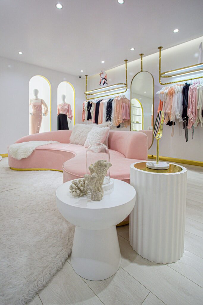
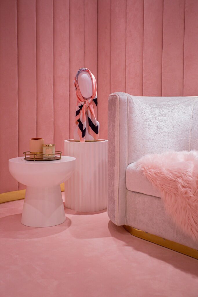
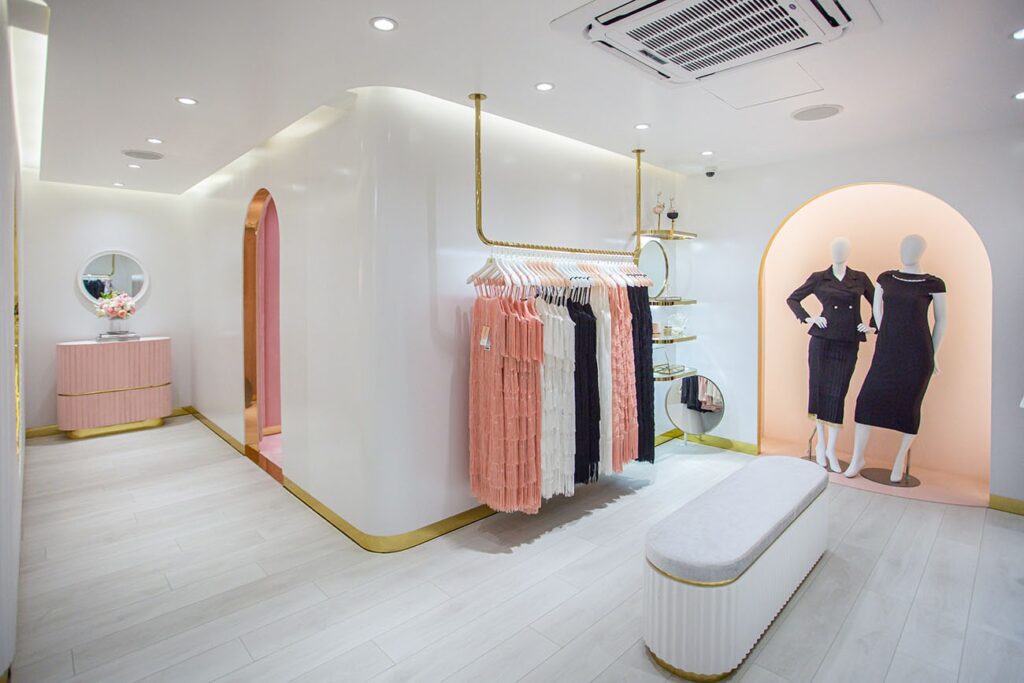
The identity and aesthetic were created by borrowing from the subtle colour combination of the pearl (white, pink and black) as well as paying homage to the birthplace. Ultimately, we studied the exquisite shells, oyster as well as the coastlines to define the delicate personality of the space as well as extract curves, volumes and pleats to create unmistakeable motifs and symbols, which are eventually revered in the overall spatial design.
Can you talk us through the outlet?
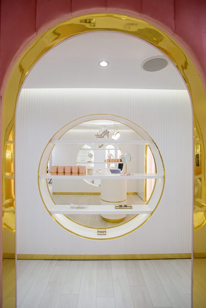
The essence of the brand can be experienced throughout the store design. Beginning from the store exterior façade, which is an abstraction of that shell facade. The brand moulded a natural shell form to create their jewellery, and that particular shell was used to draw elevation lines from the ridges and crest of the shells to create an organic composition, and then this composition was translated into protruding and sinking regions to ultimately mimic the organic texture.
The shell texture was not limited to inspiring the exterior facade only, but it flowed into the interior walls where we recreated the exact crest and ridges of the shells on statement walls spread throughout the space.
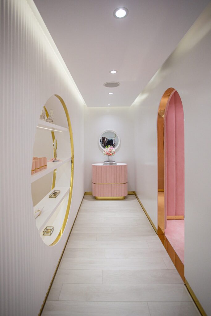
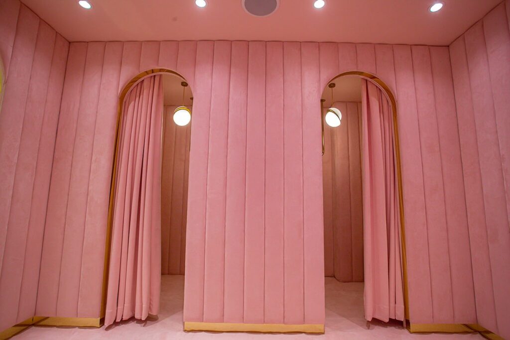
The statement changing room of the store was made to represent the romantic nature of our muse, with the usage of pink pearl colour, signifying the elegance and plush velvet that is a solid part of MUKTA’s material identity.
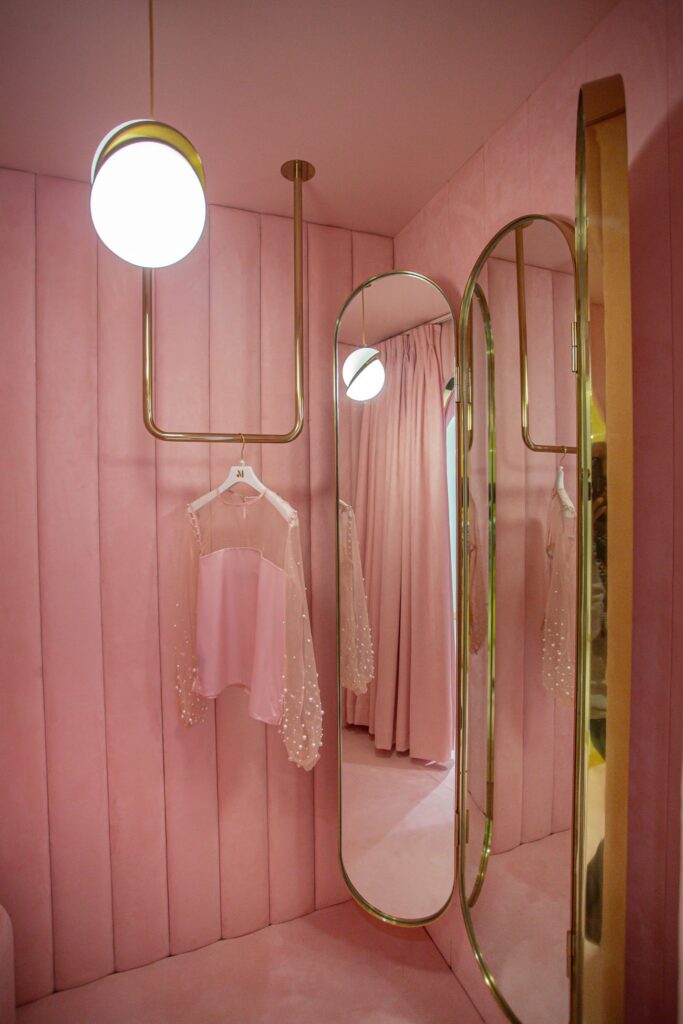
The pleating panels adorning all the walls and surfaces are a direct homage to the pleating created by the crest and ridges in the surface of shells.
The curves of the pearl as well as the shell is a defining point to all aspects of form development of the interior. One key feature that is highlighted throughout the store is the absence of any sharp edges. Whether the furnishing, lighting, the walls or arch opening, we used curves throughout.
The idea was to move away from the conventional retail design and embrace the romanticism of the brand’s identity, by creating small regions of art.
Can you tell us about the colour scheme and lighting arrangement of the place?
The interior has been painted with the brand’s hues. The most appreciated colour of the pearls – white and pink, and each colour signifying the characteristics of the muse of MUKTA. All the accessories including the lights and metal hardware have been designed as sculptural pieces in gold tone, inspired by the sculptural quality of the gold-plated jewellery of the brand.
Tell us about the choice of furniture and decorative accents?
The purpose of the furnishing was to add to the story of the brand; therefore, we customised most of the furnishing to match the narrative. We ensured that the furnishing followed the colour scheme of the brand and the material – the plush velvet and golden accent that has been used throughout the brand’s packaging and products, or acrylic and glass to define the delicateness and femininity of the brand, the shape and curves was inspired from different shells.
Any further expansion plans?
The flagship store is the starting point for the brand, we plan to expand both locally as well as internationalise the brand. We will be carrying the concept of MUKTA and carry the unmistakeable identity and language we created to the upcoming spaces.